Remember the Human Rights Campaign’s pink equal sign that we wrote about last week? Well, it’s died down a little, but it’s still going pretty strong. It seemed nearly everyone on Facebook had at least one friend change their profile picture, but the evidence was anecdotal…until now. Facebook has released some interesting stats talking about the spread of the campaign, and there are some important lessons to take away for small business SEO wondering about the value of social media.
Obviously, millions of Facebook users change their profile picture on any given day, but 120% more than average changed their profile picture on the 26th, the day the Human Rights Campaign issued their message urging users to switch to the pink equal sign. Here is the graph released by Facebook showing the swing, the dotted line towards the right indicates when the Human Rights Campaign made their post:

As you can see, there is an undeniable uptick in changes. Correlation doesn’t always mean causation, but in this case I think we can assume that one lead to the other. Thanks to Facebook’s incredible analytics, we also get information about the age of the people changing their photos. In the graph below, the left-hand image shows us the amount of profile photo changes on the 26th (red) over the amount of changes the week before (black). On the right, you see the increase in percent of users changing, again by age:

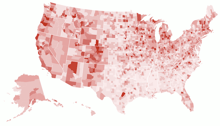
Finally, in the map we posted at the top of this article, you can see where the most people changed. The darker the color, the more people who changed their profile picture in that area. The data is about what you’d expect, with more conservative areas being pale and liberal areas being dark. The interesting thing about the map from a marketing standpoint is just how small an area Facebook can target when displaying this kind of data. Honestly, we know they can go even deeper, making a map with data down the the city level. The only reason they didn’t is probably because such a map would be a mess to look at.
It’s good of Facebook to release this kind of data to the public, and it truly illustrates what a powerful platform the social network has become. Also, whether or not you agree with the Human Rights Campaign, you can’t deny their success. To have an impact so strong that it changes the entire country’s stats in a meaningful way is an achievement most movements (and advertisers!) can only dream of.