Early on in 2013, Bing gave us a preview of what the future could hold for the search engine. Now, we’re seeing that preview come to fruition. It’s a whole new look and feel for Bing, and even though it feels very strange to say…we think we like it. Let’s take a look at what’s different and how it may affect your Bing SEO.
First thing that’s different, as you may have noticed above, is the logo. The font has been changed to Segoe (the Microsoft Corporate font of choice) and the new logo itself is a stylized B. This brings Bing into the fold with the other updated Microsoft logos, creating a singular family of style and color. Check it out:
As you can see, you now have the four major components of Microsofts business, each representing one of the colors of the original windows logo. This is part of Microsoft CEO Steve Ballmer’s vision, who has been talking about a new and united “One Microsoft” vision since last year.
The changes to the search engine itself are rolling out slowly, but you can get a preview if you go to Bing.com/new.
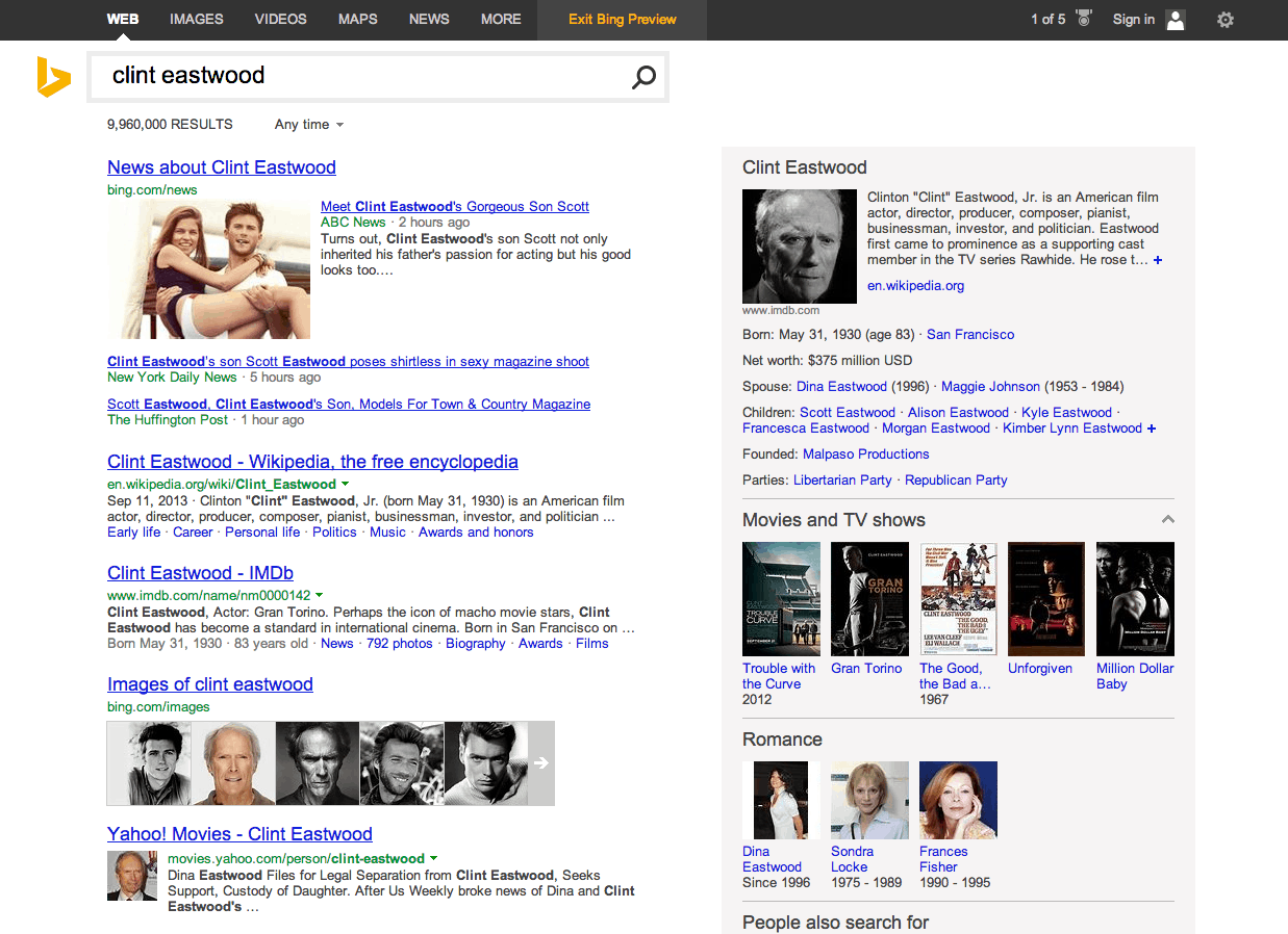
First, here’s a snapshot of a search using the new Bing:
As you can immediately see, there is a whole lot more information being delivered here than ever before.
The new features include:
-An updated Interface. Bing now features an organized two-column view that has a variety of information. The links are the same, but the fonts are different and the layout is boxier. The boxy layout looks alright on a computer, but it’s really designed to shine on the various mobile devices like tablets and phones.
-A Page Zero. Basically, page zero is before page one. As you’re typing in your search query, you’re already getting results within an autocomplete box. This makes being in the top five positions more important than ever. If this program is successful, before you know it, the first page will actually be page one and a half.
-Snapshot. Snapshot is all that information you see on the right side. Also built-in on applicable searches will be social information from what was previously known as the social sidebar.
-Pole Position. This is a big one for SEO. Pole position is essentially a suggested result. The pole position result is a result that Bing is very confident answers your query. When it comes to your big money terms, you want to be the pole position.
-Mobile. As we mentioned earlier about the boxes, Bing has been redesigned from the ground up to look great no matter what device you’re using it on. This could be a big money feature if the experience is significantly better than Google AND native on all Microsoft Tablets.
Go to www.bing.com/new and try it out for yourselves, and let us know what you think!

