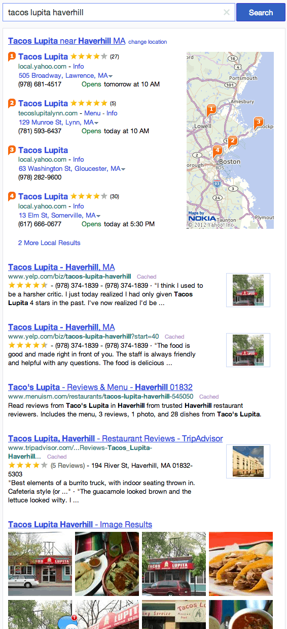
Yahoo has been making moves lately. Last week we wrote about how they are trying to acquire Hulu to give themselves a foothold in the streaming video business, and this week they unleashed a facelift for their search engine results. Is it a stunning new look that’s going to completely change the search engine game? Are you or your SEO firm going to scrambling to try and rank for Yahoo as a result?
No, but you can’t blame them for trying.
The new results get rid of some clutter and put the search results front and center (it’s a wonder if took them this long to figure that out.) They include a new nav bar across the top that links you to your other Yahoo services, including mail, news, weather, and flickr. They also included a small update on the backend so that everything loads a little faster. The only thing they forgot to include is a time machine to go back to 2005 when anyone cared what they did.
We’re being a little mean, but Yahoo’s new look is just trying to emulate aspects of Google and Bing. They’re acting like they’re innovating but in reality they’re just helplessly, hopelessly chasing the tails of their competitors. It’s clear that Yahoo is hoping to get some of their search share back, or at least save what little share they have left, but this move isn’t going to be the thing that does it. If they want to make any headway at all, they need to innovate, not emulate.
“Over the coming months, you’ll see more from Yahoo as we work to deliver a search experience that combines utility with beauty and gets you to your results faster,” the company said in a blog posted Wednesday. “Today’s news is just our first step.”
Here’s a shot of the new design:
