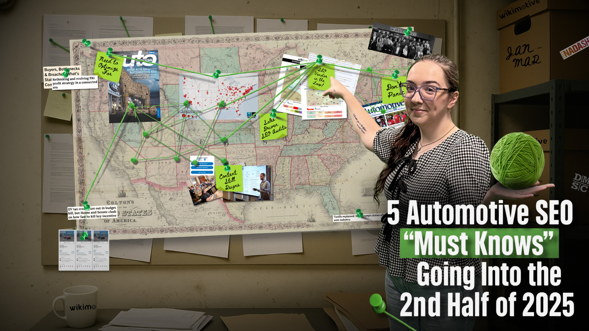
5 Automotive SEO “Must Knows” Going Into the 2nd Half of 2025
As we move into the second half of 2025, one thing is clear: the automotive SEO landscape is shifting faster than ever. From the rise of AI Overviews and chat-based search to the continued importance of intent-driven content and technical SEO fundamentals, dealers must stay agile to stay competitive. I’ve talked about all of these changes and developments in my […]